Productivity is never pretty around here. Making art is like childbirth to me. I start out hopeful and full of promise. At some point it makes me sick (I call it the “ugly phase”), but I keep going, knowing it’s worth the struggle. And toward the end, I will do anything – endure any torture – to get this thing finished and out of my space.
I have been finishing three new comissioned pieces – I just returned from installing one, and two more are awaiting delivery this week.
completed art for the offices of David Kesel, CPA
Meanwhile, my studio is ashambles. Unlike childbirth, there is no nesting going on here, just complete violent, creative chaos.
As I came back into the studio this afternoon, the amount of stuff I have strewn everywhere is insane. Paint, dirty brushes, bits of cut paper all over the table and floor, awaiting placement on some collage or journal.
Project ideas, notes scribbled on lined paper that was torn out of some book. Scissors, glazing medium, screwdrivers, nails, art supply catalogs, plastic bags, ideas for teaching art projects…
But it means I have been making art, and that is good.
The A/C went out last week, just in time for summer’s last stand. Fortunately, I am married to quite a handy man. He’s helping me out by installing a fan today. Come on, cool weather, I need you.
And, athough I’m exhausted, I’m really thankful for this hot mess of a studio.
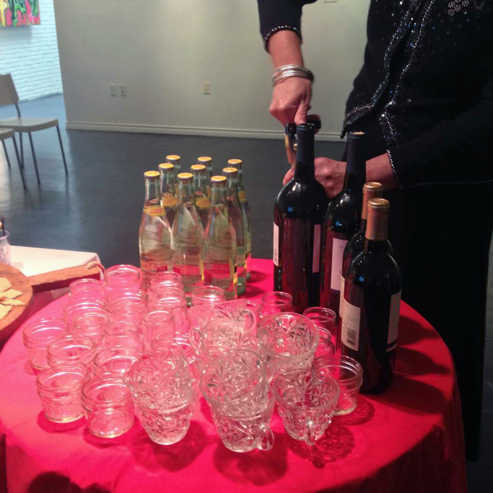
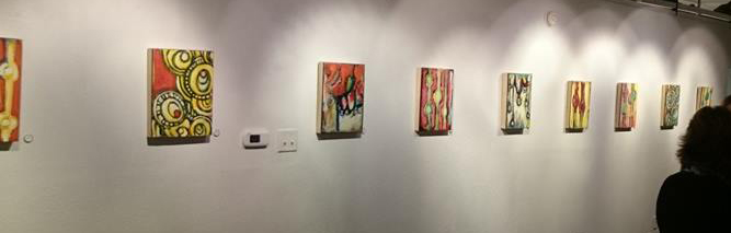
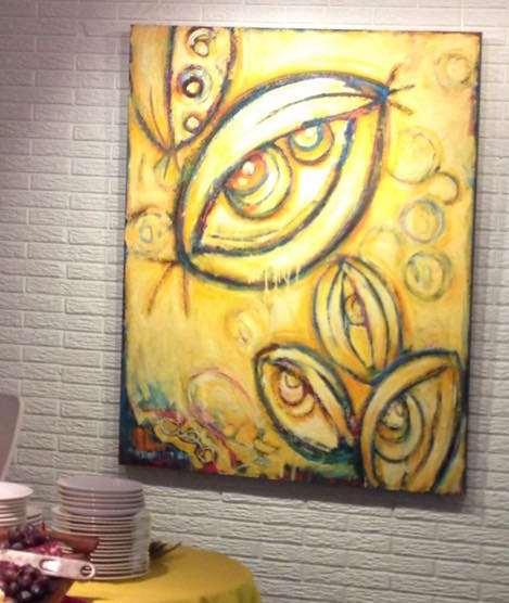
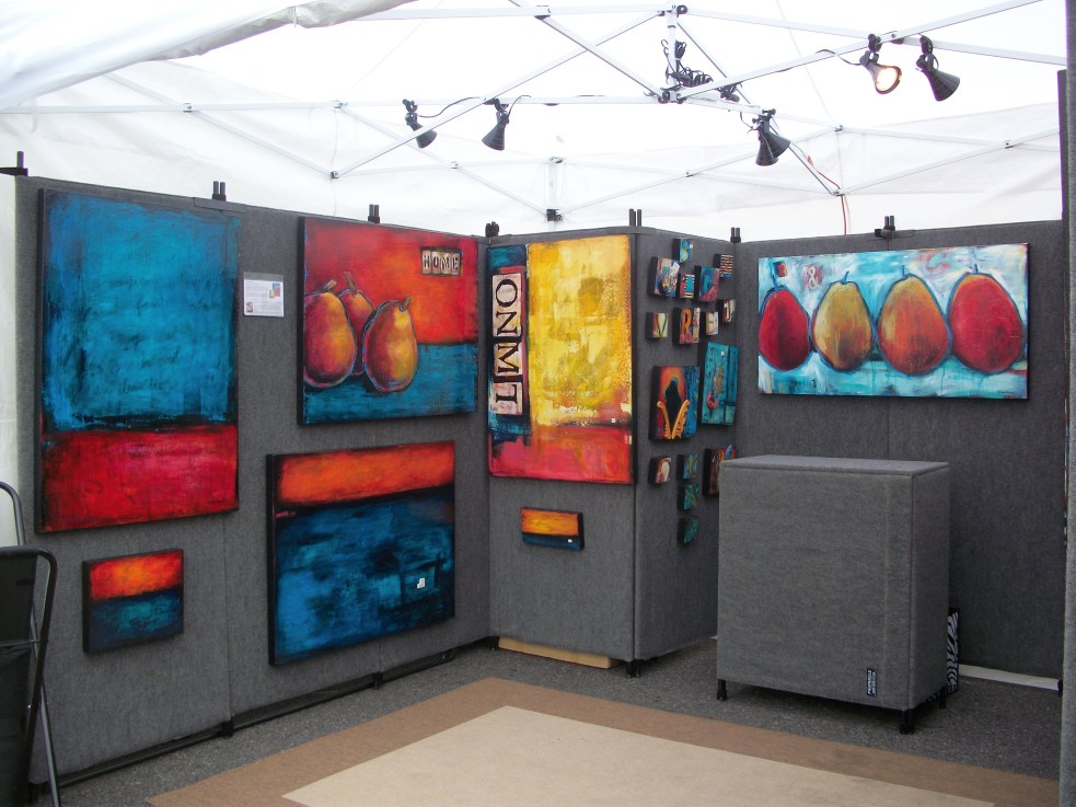
Here are some photos of my current solo exhibit, “Look Around,” which opened on Friday, January 9 at thegallery8680. It was a bitterly cold night (by Texas standards), but we still had a great turnout.
Robyn always has the most beautiful reception table — a work of art in itself.
Works on paper in the front gallery.
There will be a closing reception this Sunday, January 25 from 2-4pm.
I’ll be sad to take it down – I liked each piece in my studio, but hanging my art in the gallery really transformed the work into a cohesive unit. Here are some pieces that will have a new home after the show.
I set a challenge for myself this month to post on my blog daily, and this, my friends, is the final post for the month of April 2014. I did it!
There were days that were a lot more inspiring than others, some very exciting with good news to share, and others that I just didn’t feel so motivated about. But I’ve found that this has been a really good exercise for me — it has kept me focused each day, because I knew I would need to share something interesting each day with you.
Just like my journals, my blog posts are a good resource for me to see what was going on in my life at a particular time.
An overview of this month’s posts:
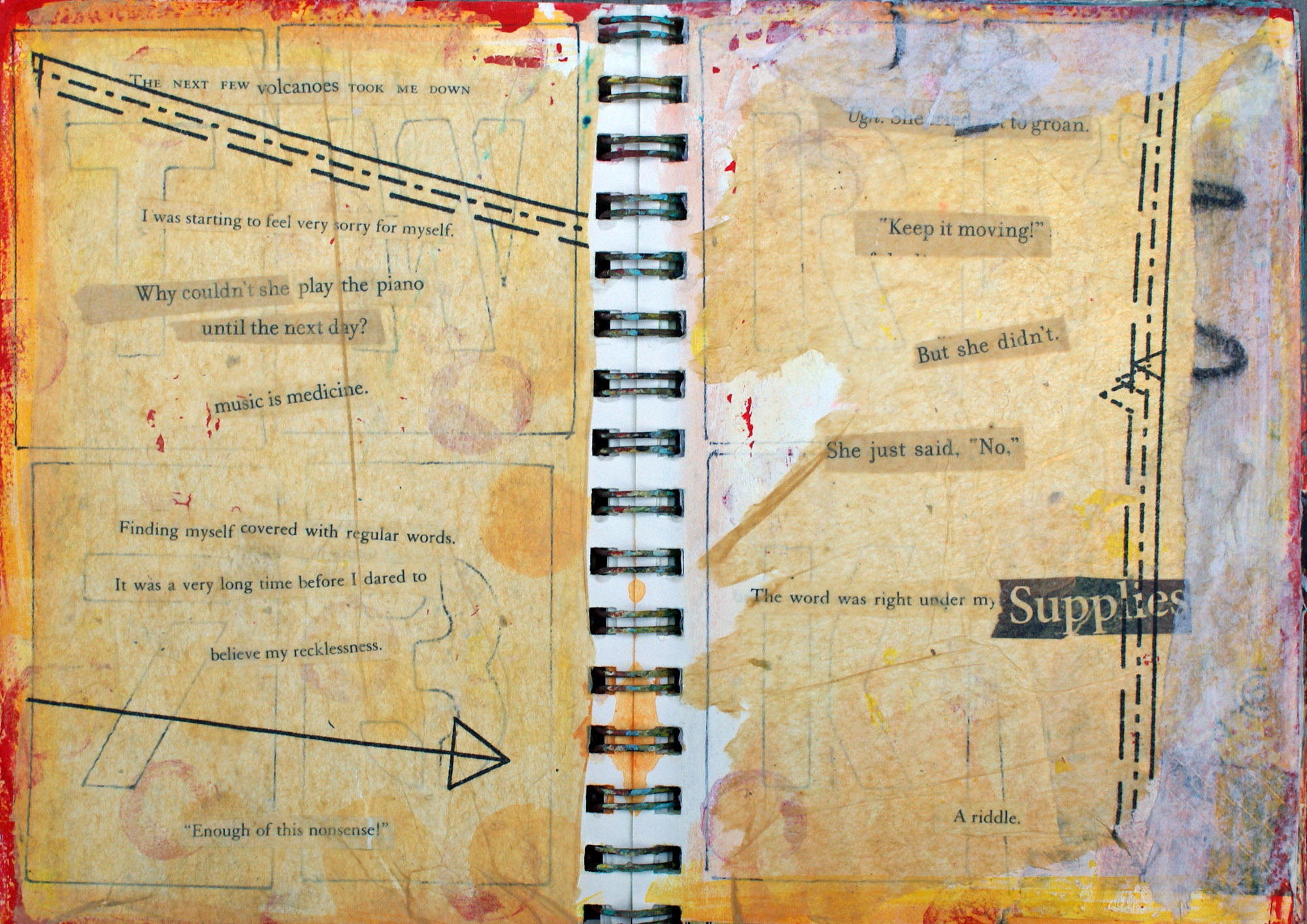
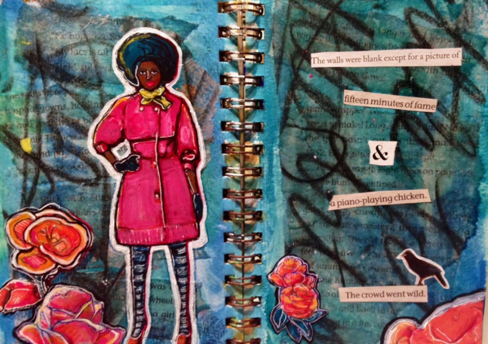
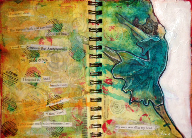
I have gotten to share some of my visual journals with you, which until this month I hadn’t published online. Posting on my blog daily has encouraged me to finish some of those journal pages that I had started but had been dragging my feet on finishing. See awesome april posts # 1822, 23, 25 and 27 for new journal entries, and I have a new visual journals page that I’ve been adding to all month.
I shared things that inspire me along the way(days # 5, 6, 7, 14, 20, 28) and the advice I would give to my artist self 20 years ago (#16).
My trip to Europe is officially on the books, which is something I’ve wanted to do for a while. It’s been 10 years since I traveled overseas, so I’m happy to have something fantastic to look forward to next year.
You got a few glimpses into my studio (day # 10, 15, 26, 28), and the studio of my friend Jennifer Cowley (day #2). I also shared a few of my art friends (day #11 and # 24), as well as some of my students’ work in progress (day #3).
I’ve had a great month getting my work out there. I revealed the news that I was selected to complete a public art mural for McKinney this spring. ( I’m still waiting on a start date, and I’ll keep you all posted on the latest developments with that project). Meanwhile, I’ve also sold a few paintings this month, and been selected for a juried show.
Thanks to all of you who have been reading my blog this month, and to my new ‘followers.’ As always, I’d love to have comments from you on any of the posts.
I have been layering found images into my paintings for the last several years, but sometimes I wanted the paint to have more surface texture. There are many additives you can put into acrylic paint, but most of them either take a lot of layers to build up a thick surface, or they are opaque. I wanted the texture, but still with transparency. Enter encaustics!
I have admired encaustic work for some time – it has a very deep, luminous quality — but wasn’t quite sure how the process worked. So, I took a couple of classes over at The Encaustic Center in Richardson and immediately knew this was a medium that I could continue to experiment with.
Portrait of a Boy, Egyptian, Roman Period 2nd Century
What is encaustic? It is painting with heated beeswax! It’s an old method that has been around at least 2500 years, and was used by the Greeks and Egyptians for painting everything from boats to portraits. Find out more about the history of encaustic painting HERE.
Jasper Johns encaustic map painting, 1961
Probably one of the most notable artists from the past 50 years that employed encaustic painting in his work is Jasper Johns, famous for his paintings of maps and the American flag.
encaustic paints in my studio
I make my encaustic medium (beeswax + damar resin) in a large electric skillet. I then use oil paints to add the color (pigment) to the clear medium. I have a separate griddle for this, with 16 oz. ink tins lined up with the colors I want to use. This is the same setup used at the Encaustic Center, and in most books and articles I’ve read on encaustic painting. Some artists buy their encaustic paint already made (R & F has some really good paints), but they are very expensive.
And the Rain Washed it Away
What I love about encaustic is it’s a very fast, spontaneous medium. It dries quickly (think of how fast candle wax hardens), and can be used for both additive and subtractive techniques. You can also layer paper into your work easily — including drawings, photographs, collage, ephemera, etc. Imagine how exciting this was for me, as I love to glue all kinds of things into my paintings! To have a true “encaustic” painting, you have to fuse each layer together, slightly re-melting each layer to make sure it adheres to the one below it. I use a heat gun most of the time, but have just started enjoying using a torch as well. (However, when I add paper, I try to keep the torch far away).
In my newest series, I drew with charcoal or pastel onto tissue paper, then layered those drawings into my paintings using clear encaustic medium (clear paint, with no pigment added). The tissue paper became so transparent, that you can hardly detect the edges in the painting. It allowed me to “float” my drawings on top of previous layers of collage and paint. And the drips are now in 3D!
Courage
I just added a few more encaustic pieces to my web site, which you can find HERE.
125 Juried Show, Plano
And I’m happy to announce that two of my larger encaustic paintings were accepted into the 125 Juried Art Show, which opened yesterday. The show is at The ARTS Gallery at Collin College, 2800 E. Spring Creek Parkway, Plano, TX 75074. The show runs April 28 – May 17, with a reception on Thursday, May 8 from 5:30 – 7:30pm.
There’s nothing like new art materials to make me excited. I just got some new paint sticks last week, and have been looking forward to this week – lots of studio time. Tomorrow is the day!
I’ve been using these a lot with my encaustic work, but also love to draw with them in my oil and acrylic paintings.
“Today I Feel Refreshed and Excited”
I also use oil sticks for many of my drawings on paper.
This slideshow requires JavaScript.
I finally made some new cradled panels this weekend, too. Thanks to my hubby for his help with these (or for letting me help him — he’s so much better at mitred corners than I am).
I made these underpaintings a few months ago, but now that I have the cradles on the back, they are ready for me to layer paint and color. Who knows how much of my original painting will even be visible when I’m done (probably not much). I can’t wait!
This is from my first visual journal, which is actually an altered book. I gessoed out the pages before adding acrylic, collaged photocopied images, collaged wallpaper, watercolor and permanent marker. See more of my visual journals HERE.
The mother and child image is universal to all cultures, and is always one that is close to my heart.
What are some of your favorite topics for your visual journals? I’d love to hear your comments!
Today I’m sharing some of my most recent Artist Trading Cards. I still have some of the Joie de Vivre images left over from some wallpaper sample books (see my post on Domestics for more). They’re just the right size for my mini works of art. Pair the “joy of life” images with interesting text, and you have a recipe for fun. Click on any image to open a slide show of this series.
Personally, I Drink Coffee, ATC via freshpaints.com
What do you mean?
Client
Waiting
Something Unusual
Little Details
With Him
Brave
Story
C (Childhood)
All ATCs are 3.5 x 2.5.” See my ATCs page for more of my trading cards.
I am happy to announce that I have been selected as the artist for McKinney’s first public mural project. Today I was honored to be a part of the official unveiling of my design, during the Arts in Bloom event on the square.
Here you see me with the design, along with some of the Arts Commission members. Left to right is Matthew Bado, myself, Hamilton Doak, vice-chair of the McKinney Arts Commission and owner of Orison’s Art and Framing, and Mayor Pro Tem Travis Ussery. Also in attendance, but not shown: Linda Spina. (A big thanks to Allegra & Helen Minkes for their support and awesome photography skills!)
In addition to the City’s funding, there have been private donors that have also made the mural project in McKinney a reality, so a big “Thank You” is due to everyone who had the vision of bringing a public mural to their city. I’m grateful to have been chosen for the task, and know it will be a fantastic addition to downtown.
I’ve been working on this project for a few months now. After submitting my application in December, I worked on a couple of rounds of designs in January and February. I was notified in March that my design was selected, and I’m waiting to get the go-ahead, once all the details gets cleared through City Council.
For my concept, I went with an Art Nouveau-esque design, inspired by artists like Alphonse Mucha. The design includes cotton fields (a huge part of McKinney’s history), and native wildflowers that have each special symbolism that relate to the downtown area (paintbrush, trumpet vine, wine cup, blanket flower). The actual mural will be even more vibrant and full of detail.
So where will this mural go? Glad you asked! The mural will be on an exterior wall of a downtown building (currently slated to go on the south wall of the Cadillac Pizza building). The finished painting will be 40 feet wide, and about 9 – 10 feet tall, and I estimate it will take 4-6 weeks. I plan on posting pics of my progress along the way, so stay tuned!
artist Lynne Hubner
While I was there, I enjoyed seeing the other artists working live out on the square. I was excited to meet Lynne Hubner, a very talented and skilled printmaker. I had seen and admired her work before, and she currently has a great exhibit of her prints at the front of Orison’s gallery. She was super nice, and I was even able to pick her brain about some of her printmaking techniques. I’ve got my eye on a couple of her prints……. you can see her work at lynnehubnerprints.com.
Richard Miller at work
And I also had to stop and meet this artist, as I had watched his painting progress over a couple of hours. Being a fan of color, I was impressed with his use of complementary colors (green/red is a difficult combo to make look good, but he’s doing it!), and his expressive use of line. He told me he has a Facebook page of his art, so I’ll need to check that out.
As you probably know, I moved into a new studio this past year, and as I’ve been sorting through my work, I noticed I had a lot of smaller paintings and works on paper. Many of these are either studies for larger works, small works from a larger series, or figure drawings from multiple live modeling sessions I’ve attended over the past few years. Seeing these works, and considering the current ‘economic crisis,’ I was inspired to create a show that involved 50 works of art for only $50 each.
I wanted to make my art affordable for those who want to collect my work, but may not be ready to invest in larger, more expensive paintings. I also personally love to see artists’ quick studies and smaller works, as I feel that they sometimes show spontaneity that larger, more deliberate works may not possess. Maybe you’ll enjoy that, too.
About half are works on paper, and the other half are paintings. The largest work is 30 x 22″ and the smallest work is 8 x 8″. There are quite a few figurative works in the show, which may seem out of line with the work that is currently on my web site. However, I have always really loved figure drawing. (Ok, maybe not my first day of Figure Drawing 101, when I was too embarrassed to actually look around my drawing board to see the nude male model. But soon, I began to love the endless possibilities of drawing the figure, with all its angles and curves and lines). I still attend sessions with live models as often as I can. It gives me a great excuse to play with color and line. These figures are going to show up in new work, too, so keep an eye out.
I’m trying to keep most of the show under wraps until the opening. If you can’t make the show, I’ll have it posted here on the blog on Saturday (09/22/12). Click the 50/50 link at the top of the page.
If you just can’t wait, and want to be teased a bit, here are some detail shots of some of the work.
Here’s a look at some of my newest work, hanging in the Iconic Love show here in Frisco.
Iconic Love at Frisco Discovery Center
Here is a look at my work at the Discovery Center (8004 N. Dallas Pkwy). The reception for that venue is this Friday, February 17, from 6:30 – 9:00pm. Come see it — they all look so much better in person! Details (and better pics) on my web site www.moliverfoster.com.
(how to be) a work of art
Announcing my newly published art book, “(how to be) a work of art.”
It is a simple, easy to read book (your 1st grader can read it), with insight for all ages! Each image is one of my favorites, and includes a one-word synopsis that hints at the meaning behind the art work.
This is great for a coffee table book. Click the image at the top of this post to preview and order the book online.
I got to spend this past weekend exhibiting at Art City Austin, enjoying a great location right at the intersection of the 1st Street Bridge and Caesar Chavez streets.
It was great hearing what attracted people to my work, and it’s always interesting how different artworks affect different people. Of course, most people knew right away if they even wanted to wander into my booth– if they were afraid of color, then my art wasn’t for them. But those who have a passion for color like I do, came on in and took some time to study the layers in my work. They were often impressed by the depth of color in my work. A lot of my works have many layers of paint — (sometimes one or two entire paintings) underneath the surface. I also use glazes in my work to create transparent layers, which really help to make the colors deep. It’s really hard to get good photographs of my work, and seeing them in person is the only way to truly appreciate the depth of color.
I met a lot of great people — gave away hundreds of business cards, and sold several works of art. Thanks to Patrick, Ellie, Colleen, Remi, and Katherine for their patronage and encouragement! Austin has been one of my favorite places to visit for the past couple of years, and Art City Austin was a great place to show my work.
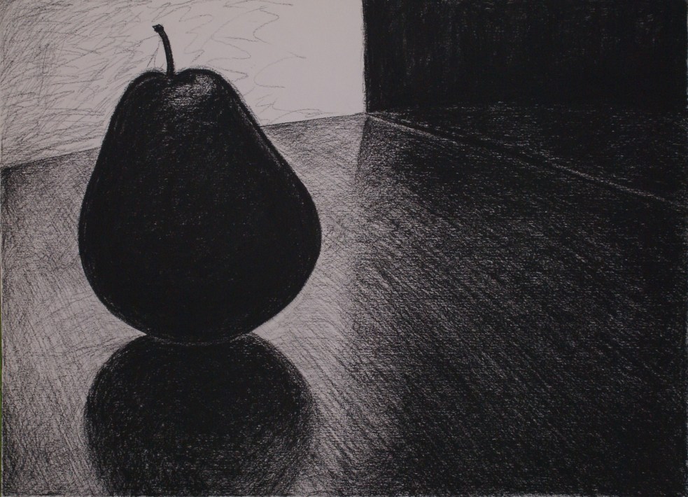
As I mentioned before, I’ve begun a new fixation with pears. They have shown up in some my paintings over the past couple of years, but this time they’re the main attraction. I’ve been buying pears each time I go to the grocery store, and then I’ll come home and set them up on my kitchen table. I’ll draw directly from observation, as well as take a ton of digital photos. These photos were the source for this new set of drawings. I took some photos during the day, and some at night, trying to create the right groupings, lighting and composition.
Only Child
As much of my other work, these explore family relationships. However, instead of using people, I put pears as stand-ins for myself and others. (The titles give a clue to what’s going on in each composition). It’s funny that even my kids know which pear specifically represents them without me telling them. Now I have dozens (maybe hundreds) of new reference photos, with all kinds of “people” in them, so there’s no telling how many drawings and paintings I’ll do in this series.
Sisters
Through this process, I’ve discovered a renewed interest in drawing, specifically in charcoal. I enjoy working really loose, and gradually building up rich, dark values. Working in monochrome has been liberating, as I don’t have to worry about color. It has been a good diversion from painting. As I started back on some of my paintings today, I had a fresher outlook. I found that my mind had shifted into a different kind of art-making, and helped me get back to painting with a new perspective. Plus I think I came out with some interesting drawings, and I’m inspired to do even more.
“One of the hardest things in the world is to see yourself objectively. I’m not sure it’s even possible.”
I recently (last week) decided to start doing at least one self-portrait every year. I’ve only really done a few “official” self-portraits in the past. Of course, each work of art has my heart and soul in it, but there are some that are more personally reflective than others. Let me share them with you.
Self-Portrait at 15
Here’s the earliest self-portrait I can find, made in August of 1988, when I was fifteen. I hadn’t had a lot of artistic training up to that point, but I think I got a pretty good likeness. At least that’s how I remember myself looking. (Check out those bangs!)
I’ll continue by skipping the horrible self-portrait I did in college, the result of a class assignment. A family member owns it now and will not let me take it back and destroy it. Or atleast paint over it. If I have anything to do with it, that painting will NOT make it into the art history books. It’s humiliating on so many levels.
Self-Portrait 2001
Here’s a charcoal self-portrait I did several years back when I was teaching and my students were working on self-portraits. I didn’t put a date on this drawing, but I’m pretty sure it was made in the fall of 2001, right after 9/11. I was expecting my second child and had lots on my mind. Maybe that explains the serious look.
Here’s something that started out as a self-portrait, but ended up not as an image of me, but a reflection of how I felt at the time…
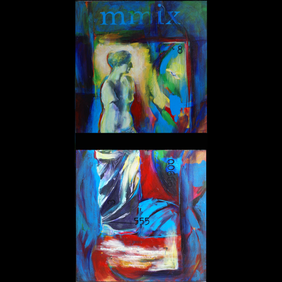
Ou est la joie de vivre? (progress)Ou est la joie de vivre?
This was begun in 2006 (top), when I was going through a very difficult time in my life. The title was always the same, “Ou est la joie de vivre?” Translated from French to English, it means “Where is the Joy of Life?” It’s also a play on words, because the collaged images that I used were taken from a wallpaper pattern called ‘Joie de Vivre,’ which shows families happily working and frolicking, just happy to be alive, I guess. No worries in this ideal world. I worked on this painting over the next three years, keeping the collaged elements, but at some point I took out my likeness and replaced it with a woman who is turned away from the viewer. Possibly the journey in this painting is more valuable than the end product. But I think that’s true for all of my work.
36, Self-Portrait 2009
Last year I made this 4×4 inch collage entitled “36” that I consider my self portrait for 2009. It’s definitely more lighthearted than some in previous years, thank goodness!
She Comes From Texas, 2009
This painting, although I wouldn’t consider it a self-portrait, has a lot of personal connections. Also completed last year, “She Comes from Texas” uses the image of the Venus de Milo as the main subject. The title comes from a collaged passage, located below her feet. It is a quote Ernest Hemmingway, which I found in another book, written in the 1950s. It says, “With us, if a girl is really beautiful, she comes from Texas and maybe, with luck, she can tell you what month it is. They can all count good, though. They teach them how to count, and keep their legs together, and how to put their hair up in pin curls.”
Obviously, the point here is the irony, but I think the quote hit a nerve with me. Growing up in rural Texas, I often felt that I was viewed this way by the men and boys I grew up with. In our small-town culture, the main way I saw males communicate with females was through teasing. Most of it was light-hearted, but I tended to take things very personally, and really never felt very good about it. I learned to smile, though. As a matter of fact, one of my nicknames given to me from male coaches as a teenager was “smiley,” (in addition to “stubby” and “air head deluxe”). I thought that most men thought I was pretty dumb. Wonder why?
Self-Portrait 2010
So here is my latest “self-portrait.” I’ve been working on it for a few months, but just completed it yesterday. There’s a lot going on here, but I think that is the perfect reflection of who I am right now. There is charcoal, paint, furniture molding, computer keyboard parts, a playing card, and collaged wallpaper. The central figure doesn’t look anything like me, but I think she reflects confidence. I’ve been growing in that this year. Probably my favorite part of this is the blue square behind the girl’s head — it’s a Post-It Note. Any mother or ambitious woman can relate to needing constant reminders, all over the place, all the time. It’s definitely been one of those years for me.
It will be interesting to see how my life, my style and my self-perception changes over the years. I’ll keep you posted.
“Creativity is allowing yourself to make mistakes.
Art is knowing which ones to keep.”
-Scott Adams
I like my work best when I let myself be free and loose, and not getting too attached to what’s on the canvas at any given moment. Sounds fun, but it really isn’t that easy to do. I have to keep reminding myself “Don’t be afraid to mess up. It’s just paint.” To really make progress, I have to get into this certain frame of mind, where I’m immersed in the paint, and not really thinking about the outcome. It’s a place of subconscious that I haven’t been able to explain…..until today.
When I found this quote yesterday, I didn’t know who Scott Adams was, so I did a little research on him today. Turns out, he’s the creator of the “Dilbert” cartoon. I checked out his blog (www.dilbert.com), and guess what he posted about today? He talks about his theory that artists get “Crazy Eyes” when they’re in the creative ‘zone.’ You can read about it here. http://www.dilbert.com/blog/entry/crazy_eyes/ Really funny stuff.
Yep, that’s a good way of explaining it — crazy eyes! That “sort of glassy, unblinking, dreamy, scary look” when someone is lost in their own imagination. I’ve never checked out my eyes in the mirror when I’m in that zone, but I can only imagine that they must look crazy. I think my husband has noticed it. He’ll say something like, “I can see your wheels turning.” Usually, in a matter of minutes, I’m in my studio, with paint on my feet and in my hair. Fortunately, some of the paint lands on the canvases I’m working on as well.
That makes me think about this painting that I finished this last month. It’s inspired by a Crazymaker that I know (a term coined by Julia Cameron in “The Artist’s Way,” and not at all the same as Crazy Eyes). This Crazymaker had been making quite a bit of crazy for me over the past several months, so this painting was my therapy to work through some frustrations. I scraped on a background layer of color, then added some personal thoughts with charcoal. The next part is kind of a blur, because I let myself just let go and not worry about how it came out. I had nothing to lose. This painting came together quickly and I couldn’t have created it if I had been trying. I just let myself make some mistakes, and artfully chose the ones to keep.
Some trivia: Scott Adams grew up in Windham, NY, and I grew up in Windom, TX. Quite a serendipitous day.
I had a lot of fun playing around with a new media today. Since I’ve noticed a lot of pears showing up in my work, I bought a bunch of fresh pears at the grocery store last night. I thought it might inspire me. Add the pears with several brand new bottles of brightly colored ink that have been awaiting the right day, and the inspiration was born!
Here’s one of the first sketches I made with charcoal. I added color with the ink, diluting it like watercolor. Once it was dry, I used oil pastels, and later chalk pastels to outline, highlight, shade and add definition.
After doing a few of these, I started to loosen up a bit. I kept the washes pretty light and loose, adding salt for texture. Here are some of the looser ones.
I have to include these two (below) because they made me laugh. Some of the ink took quite a long time to dry, and when I moved the paper, the ink ran. I knew that would happen, but I just wanted to play around and see what came of it. The pears grew appendages.
When my daughter got home from school, she saw my “models” (to use her terminology) on the table. She, too, thought they looked a lot like people. She had an acorn and put it on the stem of one of the pears, telling me to make it look like a head. So here’s the result of our creative collaboration.
These are all relatively small, done on 9 x 12″ watercolor paper.
It has finally cooled off here– no more 100 degree heat. The mornings are a little chilly, and the afternoons are warm with a cool breeze. Amazing what that can do for your outlook. Perfect weather to make some art!
Within the past few weeks, I’ve completed about two dozen new works of art, from tiny 4 x 4″ works, to larger paintings and mixed media pieces. Some of them I started several months ago, and others I started and finished within a couple of days. I wanted to share a couple of the “before” and “after” pics with you.
Here’s a photo of some ‘works-in-progress’ that I posted on my Facebook page back in July. I had been having fun layering paint, spraying the wet paint and watching it run. I didn’t really know where I was going with these paintings, but I like to work on top of a layered background anyway, so at least I had a starting point.
And here’s how they ended up–
This painting, “Home” started out as the painting on the far left (above). As you can see, not much of the original underpainting is left, and the canvas was turned horizontally rather than vertically. The layered underpainting did help create a jumping off point. I started scraping layers of paint on top of it, and added layers of glazes for depth. I was encouraged by my friend Robyn to do a larger version of ‘Home,’ as the first one was just 6 x 12.” So this canvas seemed to be a good fit.I changed up the colors a bit, but I’m really pleased with how it came out.
“Give Yourself Freedom”
This one started out as the painting in the center (top photo). Again, not much of the original layers are showing. I absolutely love the deep turquoise blue. I don’t think the photo shows the colors very well — I may have to get one of my professional photo friends to help me out with a better shot. It’s got a nice, glossy varnish on top that brings out the juicy colors. I did a little writing in charcoal between the layers of paint, and that’s where this painting gets it’s title, “Give Yourself Freedom.” I think I was listening to a Tivo’d episode of Oprah late one night, and got inspired by that phrase, which struck a chord with me, because I think much of what holds me back is not restrictions given by anyone else but myself. Just in case you can’t tell, the white spot on the canvas is actually a keyboard piece that says ‘enter.’
As far as the third painting from the studio shot (the one with the figure in the top photo), it’s still a work in progress. I think I’ve almost worked it to death. We’ll see if it survives or gets reincarnated.
(Update: The third painting did, in fact, get reincarnated – only the bird survived. It is now “The Progression of Things.”
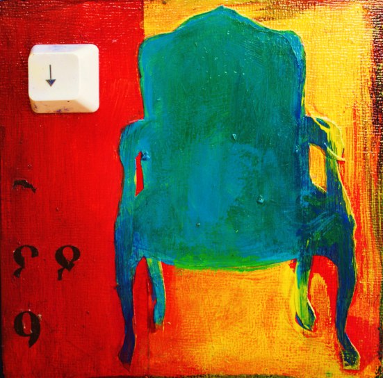
So, as I briefly mentioned in my last post, I’ve started playing around with text a little bit more in my work. I’ve already been using text for a while, but mostly through collage only. I recently came across some old keyboards and thought some of the keys might make some interesting additions to my work.
The above image is a piece of art that I just finished, titled “Home.” I’ve had it in the works for a while, layering on color and washes, creating texture and depth. I thought it looked like a landscape or seascape, until I added the pears (a symbol I’ve used in other works). Suddenly it became a still life. The pears are collaged from wallpaper (another domestic reference), but I painted on top of them so much, you can’t see much of the original. I found the perfect text for this one: “Home.” I even left the key messy with paint, to reflect my lived-in, imperfect, but creative home. I’m trying to remind myself that it’s ok if things aren’t perfect, that just makes them more interesting.
The computer keys are a fun element to add into my work, adding a little bit of three-diminsionality, but also contributing to the meaning of the art. Here’s a tiny work that I did recently, only 4 x 4″, titled “Down.” A reminder to sit down and enjoy life once in a while. Breathe.
I recently received the “Best of Show” award at the Texas and Neighbors 25th Annual Art Show in Irving for “The Gift,” so I wanted to share a little bit about this painting/mixed media piece.
The Gift
The composition for “The Gift” was inspired by a historical painting by Jean-Auguste-Dominique Ingres called “Venus at Paphos.”
I am interested in taking art historical depictions of women (typically created by male artists) and keeping the overall composition, but changing the meaning entirely. These women are no longer in the background; they are no longer simply seen as allegories of beauty and desire. They are now active participants in their own life, everyday women with interesting stories to tell.
Stylistically, I prefer looser lines and more abstracted forms than used in traditional paintings. I am influenced by the modernists: Matisse, Picasso, Van Gogh, Valadon, and Toulouse-Lautrec, to name a few. I feel a connection to their liberated use of color and simplification of forms. In this particular work, I first layered paper onto the canvas. The underlying image (a photograph of a sculpture that I took while in Boston) shows through only near the bottom of the composition — the dark areas in the female’s dress, and under the red garment of the child.
Another influece on my art is stained glass windows. I believe this comes from my background in Art History, and eventual travels in Europe. Each panel of stained glass tells a story through simple lines and bold colors. Likewise, each canvas or panel of my work captures a simple moment in time (a conversation, an exchange between mother and child), and elevates it to a moment of the sublime. Although I use the “aura” or halo in some of my work, it not meant to be religious, but rather to bring to light the sacred acts of everyday life. Using these female subjects, much of my art work deals with my interpretation of my own life: my role as mother, daughter, and wife.
Pablo Picasso said, ” Painting is just another way of keeping a diary.” For me, at least, this is true.
A lot has happened since my last post. I can’t believe it’s been so long, but I’ve been so busy creating, that I haven’t had time to write about it!
Between September and now, I’ve participated in one art festival, two solo exhibits, and three group exhibits. I began serving as the President of our local arts Guild in January. And over the past four months I’ve also designed and produced four very large public murals. So, now, it’s time to catch my breath and show you what I’ve been up to.
Starting in October, I began to come up with designs for four murals that would be in the library at Frisco High School. I met with the librarian and principal at FHS, and we discussed how they would like the murals to be very colorful, livening up the library walls and appealing to the students there. They wanted something that reflected how the library was used, and were looking for a more modern, less traditional feel for the murals. Other than that, I was on my own!
This is the first of the four murals, which measures 24′ x 8′, and is located behind the long circulation desk. I call this mural “Connected,” because it shows the students connecting with books, technology and each other in the library. I thought it would be fun to play with scale in the composition, so I made the books and notebook very large. I tried to incorporate a variety of types of students, and I even used four FHS students as models for this mural. By the time I finished, I had several requests from other students who wanted to be painted, too!
After completing my first mural, I moved on to the mural in the entry way of the library. I knew it would be one of the first things you would see when entering, so I wanted to create another image that really grabbed your attention.
On this mural, the background images were inspired by posters featuring travel, science, fine arts, mathematics, health & fitness, etc. Because of the popularity of using the students in the other mural, I photographed FHS students for each of these figures, putting them into the pose I had already sketched out on my plan. I wanted these figures to really “pop,” so I made them resting on blocks that seem to project out into space. It was fun to interact with the students who came into the library. I call this mural “Inquiring Minds.”
The third mural was at the very end of the long, narrow library. It is over the “College & Career” section, and it is called, “Outlook on the Future.” I decided to go with a simpler, more graphic design, but still wanted to play with scale and three-dimensionality. The background of this design includes a college building, a (long and) winding road, fields of blue, and a city in the back ground. The sky is full of gears, one with a compass, pointing the way to go. A lone figure stands atop a stack of books, looking at the future. In the foreground is a large book, that seems to be balanced atop the bookcase, with a graduation cap on top of it. The tassel really fools the eye, looking like it pops right off the wall. It has been fun to see the students and staff come into the library and try to decide if that book is real or not. They often have to go up close to find out.
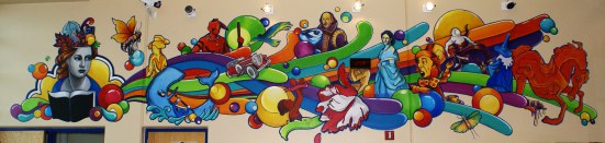
This is the final mural I painted for the library, in the fiction section. I wanted this one to be loose and fun, with a graphic, pop art look. I included references to 16 fiction books, two non-fiction books, and one really great bard. This is very close to the entry mural, and is visible from the second floor of the school, through glass windows.
The library hosted a reception for me today, and it was great to hear the responses of all those who were seeing the murals for the first time. It’s always interesting to see how each mural appeals to people in a different way. Some prefer the realism of “Connection” and “Inquiring Minds,” while others are drawn to the more stylized designs of “Outlook on the Future” and “Imagine.” I love the fact that hundreds (thousands?) of people will get to enjoy them for many years. That’s very gratifying. This project has been a great experience for me, and I hope that it makes the library an even more appealing place for the students of FHS to hang out.
So, I’ve been working in my studio. Earlier in the month I spent a great deal of effort fretting about what to make. That’s really a bad state to be in. Wanting to make art, but not knowing what to make. Fortunately, I got myself together, and gave myself a reminder to just enjoy the act of making art. Quit worrying about the outcome. Then I let myself play.
Before I knew it, I was brushing, scraping, spraying, glazing, running, layering, and gluing. I made myself conscious of how the paint moved on the canvas. I stuck my fingers in it, and it felt good! I watched it run as I sprayed water into the wet paint. I saw the color change as I glazed over the yellow paint with a dull purple. I set it aside and begin again on a new surface. The monster had been unleashed.
Right now, I have four new large canvases and twelve new small ones in the works. While I wait for the inspiration for a new image to hit, I continue to play. Laying the foundation. Painting layer after layer. Building up texture. Building up layers of meaning. Maybe the image I create when I am playing will be the end result, or maybe it won’t even be visible by the time I am done. Who knows? I have to trust my instincts and know that my subconscious is a better artist than I’ll ever be.


 Project ideas, notes scribbled on lined paper that was torn out of some book. Scissors, glazing medium, screwdrivers, nails, art supply catalogs, plastic bags, ideas for teaching art projects…


 Some of these works have text only, and some include imagery.


